SanAstra Foundation
A voluntary project where I optimized the mobile website to gather video recordings and create a global library of people’s experiences with medical practitioners. This library can be used for training and development of systems and tools that will allow patients to feel more heard and empowered when seeking help.
Summary
SanAstra Foundation set out to create a global library where people can share their experiences with healthcare providers. As a voluntary group, the budget was very tight and the founding team had limited technical experience. They currently had a single-page website built in WIX. A major limitation is that the project had no funding allocated to it and all efforts were voluntary.
My goal was to relook at the process of a person recording and submitting a video to increase submissions. We tackled it by simplifying the process, optimiszng it for mobile, and ensuring that the tone of voice was reassuring and drove trust building.
With the help of Eva, the chairperson, we created a user persona, some objection handling, and created a user flow.
I then created some wireframes and a clickable prototype. This was not development-ready, but rather to facilitate rich discussions with the board around implementation and budgeting.
While these changes have not been implemented due to the project being discontinued, early testing with potential users showed increased engagement and willingness to participate.
The Problem
Design a process flow that allows and encourages members of the public to submit videos that detail their experience getting access to medical help.
Ideation
Given the sensitive nature of the project, and that we were reliant on people voluntarily participating by sharing vulnerable and confidential information, making sure we understood who would most likely participate was crucial. These users would be those people motivated by the mission, and so we need to make sure that the value of the submission is kept front of mind for the user. We also need to make sure that the process is as easy as possible for the user to complete, as, with nothing to lose, drop off before completion is very likely.
While I acknowledge that personas are often not a useful way to understand the user, I think in the case of voluntary projects, or that speak to a very niche mission or product, they can be extremely helpful. To that end, we created a persona for Claire. While she would not be the only type of user we expect, it is the area that we expect to see the most eye-opening and previously under-represented insights from, and we wanted to begin by targetting users similar to her.
We also conducted an exploratory exercise where we focused on all the reasons why we didn’t think the goal was achievable. I find this a super helpful way to unblock the team and also lets me address potential threats that are preventing people from fully committing to the work. We start by listing all the problems and actively avoiding shifting to ‘solutions’ mode. Once we have exhausted that list, we get to tackle them!
This exercise ends with the team feeling unblocked, highly motivated, and with a renewed drive to act.
Finally, we created a basic user flow. User flows are an important part of my design process, no matter how simple the feature is. It gives me an opportunity to focus on what is most important on each screen and helps me identify where a user could get stuck.
What was:
A single-page WIX website where a user could navigate to the ‘participate’ section. The language and tone of voice was very formal and clinical.
The user would navigate to the ‘participate’ section, either by using a button to jump to the section, or by scrolling down. They would have a detailed list of what they should include in the video and then could submit the video by clicking a ‘submit’ button. This would launch an email draft with the SanAstra email address filled in, but nothing further. I explore some of the limitations in the screenshots below.
The text is very formal, it is quite passive and does not reach out or motivate the user to contribute. While the value of the project is clear, the reason why the person visiting the site should contribute now, is not.
It is great to see the process mapped out here. This helps the user know what is expected of them. The main challenge is that the user needs to navigate away from the website to complete this task, and there is not a very clear path to help them get back.
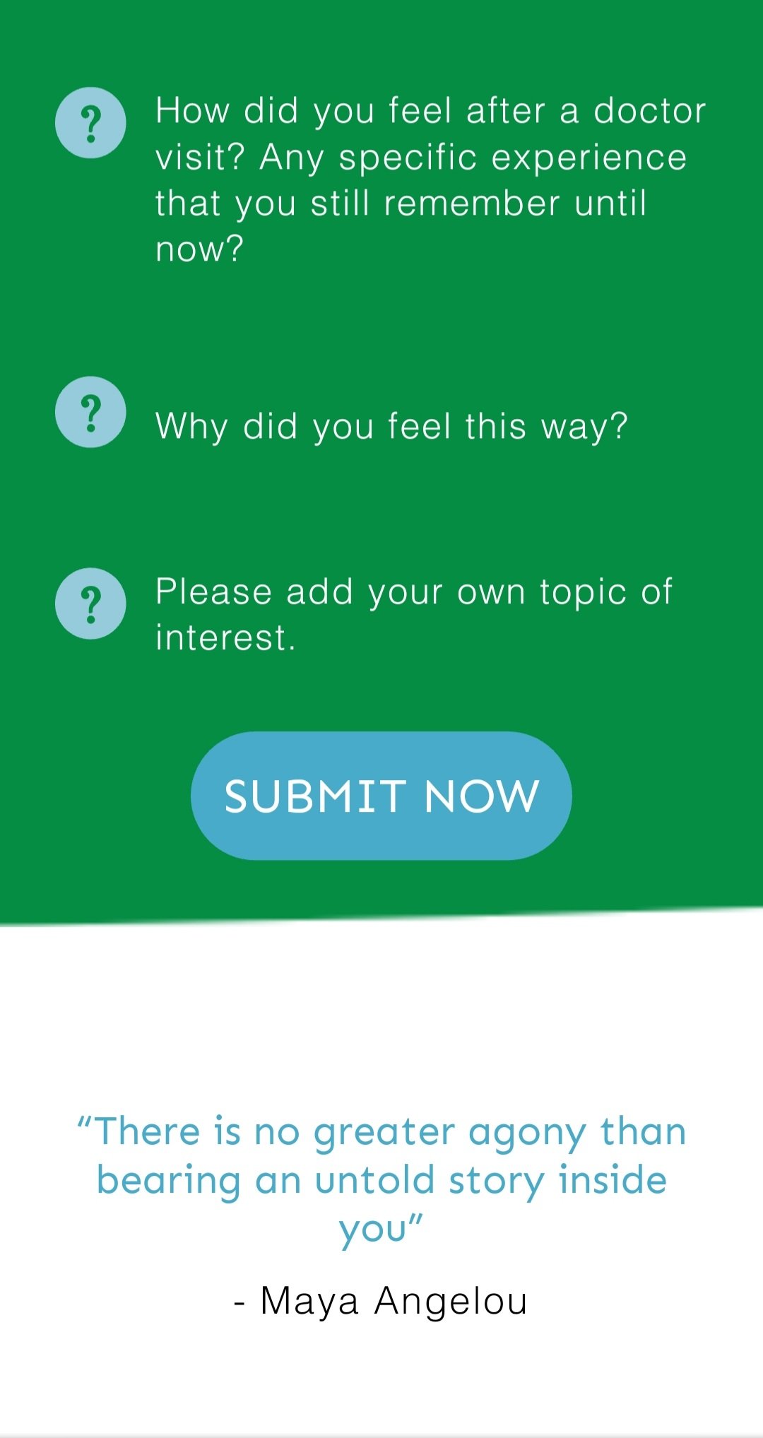
These questions are quite generic, and it is challenging to give examples as you do not want to ‘lead’ the testimonial. However, using more explanatory language would help.
Without prompting the user to have their recording complete, the ‘submit now’ button is likely to cause friction and frustration for the user.
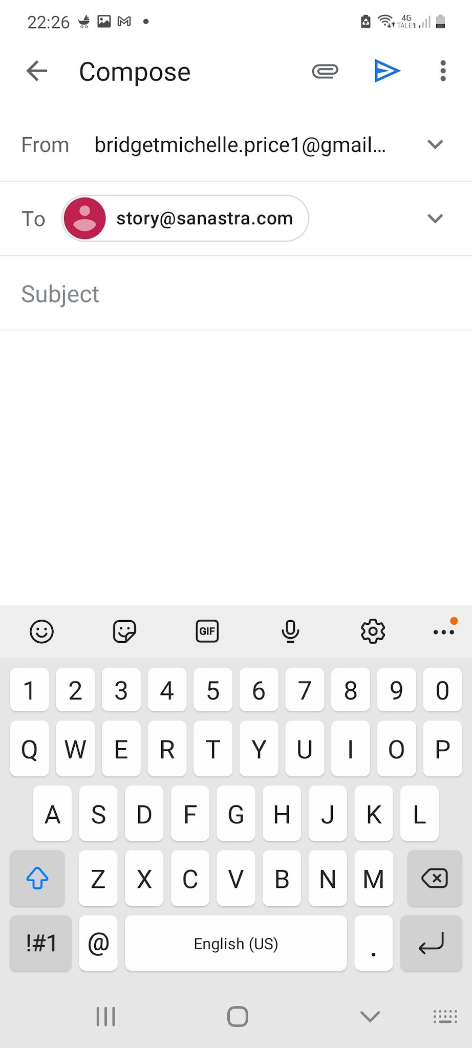
This draft is very basic and does not help the user. It would be helpful to have the subject completed, and text in the body. The goal would be to ensure the user only has to upload their video and potentially fill in their name and agree to some terms and conditions around the video usage.
My suggestions
From a copy perspective, there was a lot of work to be done to ensure that the language was much more personable and actively speaking to the user.
Technically, it would be best to have the video submission a part of the website, so that the user never has to navigate away. It also allows us to guide and motivate the user throughout the submission process.
We should capture clear permissions for the video usage and make sure the user knows they can opt out, and how to go about doing so.
You can explore the full prototype here.
We made the text much more approachable and were very clear about the usage and the ability to opt out.
By integrating the video submission, the user could choose to record straight away, or record and submit at a later stage.
After submitting, we want to be clear about the impact that the submission could have. We also need to collect data and permissions to ensure that no privacy laws are violated.
A final step is asking the user to reach out to their community to participate as well. By premaking the content, we make it very low threshold to share. But the gains are manyfold. We are able to build brand awareness, gain more submissions and use the submitter’s own brand trustworthiness to further our own.
Interim steps
While investigating the technical changes, we can and should
conduct a WCAAG analysis and ensure that it meets the standards
Ensure all images have alternate text
Ensure videos are captioned
Review all copy to meet revised tone of voice and drive connection and trust
Create an autoreply to email submissions, reminding them of the intended usage, the option to opt-out and, encourage sharing of the project
Provide a tutorial on zipping files or suggest alternatives such as Wetransfer. This would prevent frustration where files larger than 25mb may not be able to be uploaded


